Mojo's

Client: Tzvi & Eden Maller
Business: Mojo's
Business description: Jerusalem-based kosher restaurant focused on high-end street food
Project scope: Brand development & extension of an existing identity // Visual system refinement // Verbal identity // Illustration & pattern design // Packaging & printed merch (pizza boxes, bags, wipes, napkins, stickers)
Mission: Get your Mojo back, one bite at a time.
Industry: Food & Hospitality
Location: Jerusalem, Israel
Audience: Locals and visitors seeking bold, crafted food with personality
Adding personality, soul, and cohesion to an existing brand
Context & credit
Mojo’s is a Jerusalem-based kosher restaurant with a loyal local following, known for bold flavors, street-gourmet energy, and a strong personality led by its owner and chef, Tzvi Maller.
The original Mojo’s logo, core color palette, and foundational brand direction were created by Arielle Kwestel of Rubberband Studio, who did an excellent job establishing a clean, minimal visual base.
Mostdesigned was brought in at a later stage—not to rebrand from scratch, but to build on top of an existing identity and help the brand find its missing layer: character, warmth, and expression.
The challenge
Mojo’s had a strong foundation, but very little room to play.
The restaurant was intentionally designed to be extremely different in style from Tzvi Maller's former popular restaurant, Crave, whose brand was loud, graffiti-driven, and expressive. In striving for a clean, minimal, and classy street identity, the team often felt boxed in—where any expressive move risked echoing a past they were trying to move away from.
In an effort to keep things minimal, many early ideas were stripped back to the point where the brand began to lose its personality. Anything expressive felt risky. Anything playful was questioned. And yet, Mojo’s as a place is full of life.
The project required developing what was already there, in a subtle way.
Respect the existing logo and visual foundation
Keep the brand clean and legible
While reintroducing soul, texture, humor, and attitude
And translating the personality of the food, the space, and the people into something customers could experience
Strategy: Mojo's, refreshed
Rather than approaching Mojo’s as just a restaurant, Mostdesigned reframed it as a character-driven brand, inspired by Tzvi Maller is the brand's artist.
The strategy focused on defining Mojo’s inner DNA:
Unapologetic flavor
Disruption in the best sense of the word
Creativity without shortcuts
Street-gourmet energy
Craft, consistency, and intention
Food made with love—or not at all
A place where family, staff, and guests all belong
High-end street food, with heart
Expansion to an Israeli audience
As Mojo’s began attracting a more Israeli clientele, another gap became clear. While Israeli customers loved the experience once inside, the brand itself was highly Anglo-driven and didn’t immediately speak their visual or cultural language. Mojo’s felt unfamiliar from the outside, making it harder to bring people in despite the strong product.
To bridge that gap, we integrated Hebrew typography into the visual system and introduced clear, playful Hebrew slogans and explanations—embedding what Mojo means directly into the brand strategy, packaging, and touchpoints.
Examples:
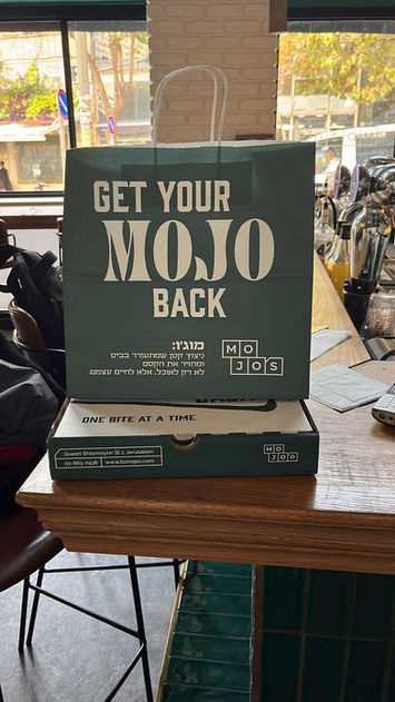
On the takeaway bag, we incorporated a Hebrew definition of the word:
מוג׳ו: ניצוץ קטן שמתעורר בביס ומחזיר את הקסם לא רק לאוכל, אלא לחיים עצמם.
On the pizza boxes, we added a call to action to the definition:
אז איך אתם מחזירים את המוג׳ו?
Verbal Identity
Copy direction that could carry across everything—from packaging to Instagram captions.
Get your Mojo back, one bite at a time.
Get your Mojo back, one sip at a time. (the adapted version for the cocktail napkins)
Yes, Chef.
More Joy. More Soul. More Flavor.
Do it with love or not at all.
How we added groove
This was not a logo redesign.
Our work included:
Refining the existing color palette, adding depth and flexibility while staying true to the original brand
Evolving the typography, giving it more edge and personality, and integrating Hebrew fonts that work seamlessly alongside English
Developing a brand strategy centered on Mojo’s personality
Creating a full system of brand assets, including:
Custom brand patterns
Illustration style and motifs
Callout shapes and graphic elements derived from the logo
Slogans and verbal identity
Designing real-world touchpoints, where the brand actually lives:
Pizza boxes
Takeaway bags
Wipes
Cocktail and regular napkins
Stickers and merch
The result: a brand with spice
The goal was not to make the brand louder, it was to deepen its personality.
Minimalism was no longer empty.
Structure gained movement.
Clean lines carried attitude.
Illustrations were loose and expressive, balancing the boxy geometry of the logo.
Typography became bolder and more playful.
Language became confident, warm, and human.
Mojo’s now has a brand that feels like the actual restaurant experience.
From the pizza box to the wipes on the table, everything speaks the same language.
Intentionally, and bursting with life.


Working with Elisheva was a total game-changer for Mojos. She helped me see my brand in a whole new light — not just as a restaurant, but as a story, a vibe, and a feeling that people connect with. She took all the chaos in my head and turned it into something clear, focused, and beautiful. Every detail — from the pizza boxes to the wipes — now feels intentional and alive with the Mojo’s spirit.
Elisheva doesn’t just design; she translates who you are into a brand that people can actually feel. I’m deeply grateful for her insight, her PATIENCE, and her ability to make the creative process both grounded and inspiring.
Tzvi Maller
Mojo's


